
Apr 2022 - Nov 2022
EonX Design System
Rebuilding a design system from the ground up for a white label product that needs scalability in mind.
Design System
Tokens
Overview
I helped rebuild EonX's design system from the ground up. It made prototyping 5x faster, took client reskins from a week to under a day, and hit full WCAG AA across the colour system.
EonX is a fintech company running several customer-facing websites off one shared design system. One is an employee benefits and bulletin hub (staff discounts at partner stores) that takes on each client's branding. By the time the new design team came together, that system hadn't been meaningfully updated in years: the visual language was fragmented, the code was out of step with the designs, and the accessibility failures were serious enough to carry legal risk. The brief was clear. Rebuild it, don't patch it. A system that met modern accessibility standards, gave designers one source of truth, and could scale across multiple brands without starting from scratch each time.

Outcomes
The rebuilt design system was delivered in full and exceeded expectations on every front. Our white label product can be fully customised.
Prototyping productivity up 500%. Pre-prototyped components meant a Figma file could replicate a live website experience in a fraction of the previous time, where it used to take a week we now take a day
Full WCAG AA compliance across the colour system, through rigorously tested, accessible token pairings and component anatomy
Reskinning unlocked for white-label clients. Design tokens linked to a GitHub repository let the employee benefits and communications sites be rebranded per client by swapping token sets, turning a manual rebuild into a configuration task
A single source of truth for design and development, cutting out the ambiguity and duplication that had slowed the team down
My Role
One of three designers, working alongside a design lead and a senior UX/UI designer
My part covered the full span of the build: auditing the existing system, researching best-in-class design systems, rebuilding from foundational tokens up, and constructing the component library through to page-level templates. The developers went through accessibility training too, so the whole team could get to WCAG AA (the standard for accessible contrast and interaction) rather than leaving it to design alone.
Problem
The websites were held together by decisions made at different times, by different people, with no shared framework that was difficult to scale for a white label product. The result was inconsistent, inaccessible, and painful to work with.
Accessibility failures with legal exposure
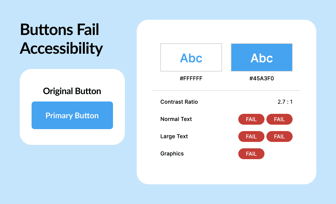
The live product didn't meet WCAG AA. Colour contrast failures were everywhere: buttons, text, and interactive elements across multiple sites failing basic legibility. For a commercial product handling financial data, that's a compliance and legal risk that goes well past design.
Visual inconsistency at every level
The design files had the hallmarks of accumulated debt: icon line weights that varied within the same page, icon sizes that skipped major intervals, buttons that changed shape between desktop and mobile. It made the product feel unpolished and untrustworthy.
No shared source of truth
Design assets were scattered across files with no canonical version. Starting a new project meant rebuilding prototyped components from scratch, with no reliable reference for designers or developers.
No rebranding capability for white-label clients
The core product was a white-label suite (an employee benefits portal, a bulletin board, and a communications site) licensed to client organisations who expected it to carry their own brand. The system had no way to support that. Every new client rebrand meant manually reworking components and styles from scratch, which was slow and didn't scale.
Goals
Improve accessibility, usability and designer efficiency
Clear every WCAG AA failure across the suite of websites
Consolidate all design decisions into one well-organised file that works as a source of truth for design and development
Push prototyping productivity up sharply with pre-prototyped, reusable components
Build rebranding into the tokenised component architecture, so the white-label suite could be reskinned per client without rebuilding components each time


Process
Process - Discover
I audited the design files, the live sites, and the component library, and the scale showed up fast
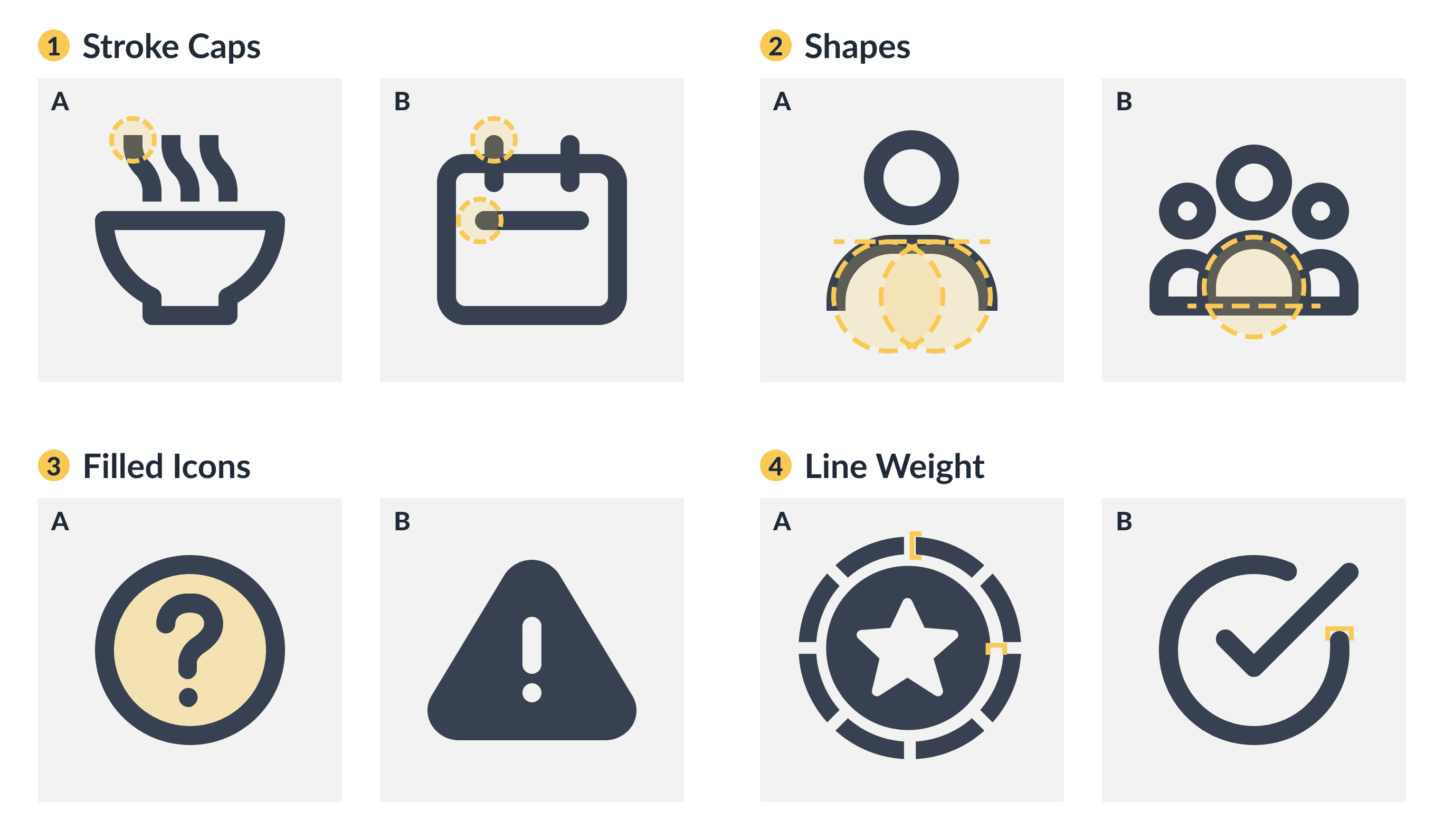
The icon set alone had four separate problems: inconsistent stroke caps (some round, some square), varying fill styles within the same thematic group, line weights that deviated from the 2px standard, and size increments that ignored the spacing scale. Small things individually, but together they were why the product felt incoherent.
Then I set a benchmark by studying systems that already work
Researching well-regarded design systems, including ones from major product companies, made the shared traits obvious: icons with uniform line weight and size, type scales with clear hierarchy, colour used with semantic intent, accessibility treated as a requirement rather than a later check, and design tokens as the connective tissue holding it all together. That gave me a clear picture of what "good" looked like before I built anything.
Process - Develop
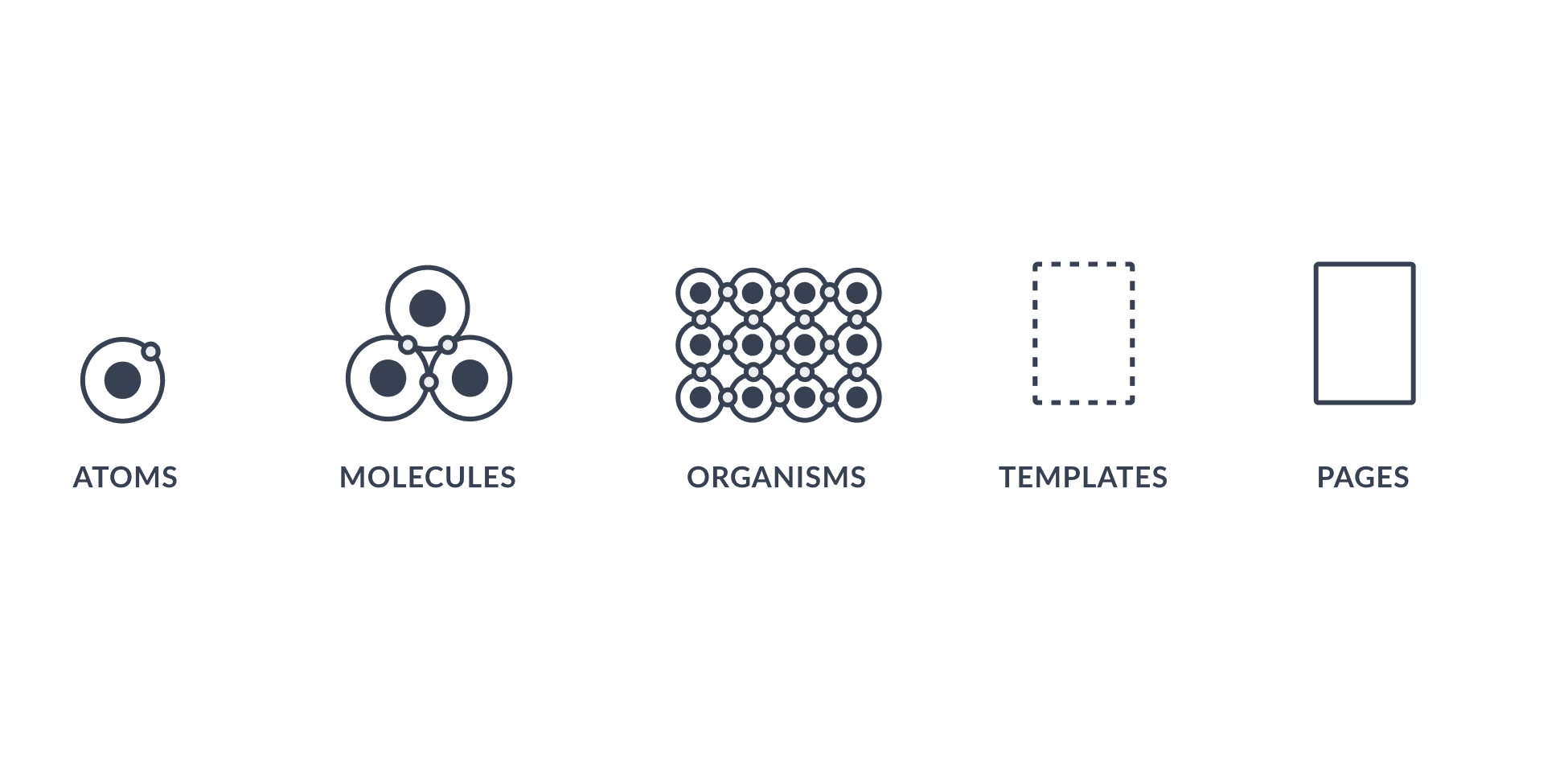
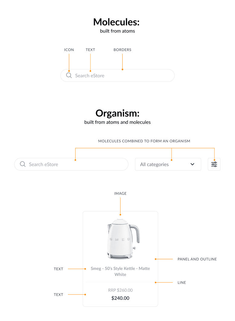
I structured the whole build with Atomic Design so it would scale by default
Using Brad Frost's method, atoms first, then molecules, organisms, templates, and pages, each tier references and builds on the one before it. The approach was deliberate: it keeps the system internally consistent as it grows, instead of drifting the way the old one had.
Typography and the rest of the foundations got the same treatment
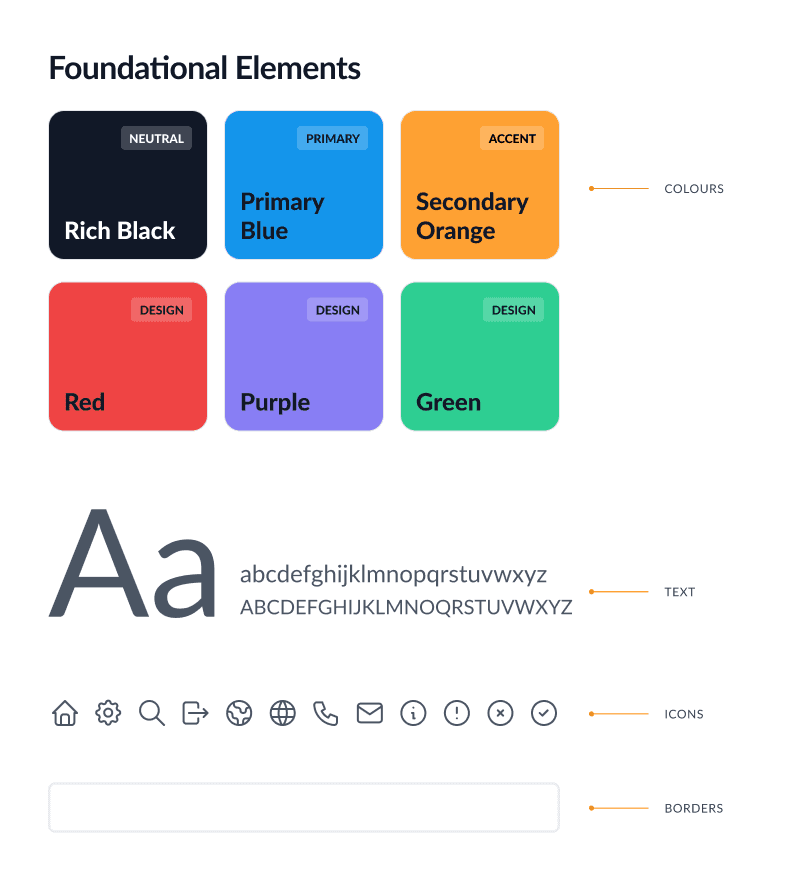
Font scales were rebuilt with proper visual intervals for desktop and mobile, replacing the ad hoc sizing that had piled up. Spacing, sizing, stroke widths, border radius, blur, and opacity were all systematised and documented. It's the unglamorous scaffolding that makes a system feel coherent rather than cobbled together, which is exactly why it mattered.
Component construction was the most complex phase, and the biggest payoff
Pre-prototyped components, with hover, focus, expanded states, and animated transitions all built in, meant thinking through how each state behaves across contexts and screen sizes. Every state had to pass contrast thresholds as well as look right. Expanding elements had to animate without breaking the layout around them. Button placements and labels followed established interaction conventions so behaviour stayed predictable across the different sites. Once the library was in place, new pages could be assembled and prototyped in a fraction of the time it used to take.
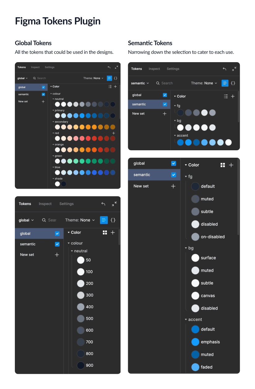
Design tokens were where the biggest impact landed, and it landed hardest on the white-label business
The core suite was licensed to multiple clients, each wanting the product in their own brand, and before this, every new client meant reworking components and styles from the ground up.
Process - Launch & Test
With the token system in place, each client brand became its own token set inside the plugin
Swapping colours, typography, and visual style across the whole component library happened instantly, without touching a single component. Global and semantic tokens were structured so a complete visual transformation (colour, type, spacing) could happen without anything breaking, which cut the reskin work from about a week to under a day.
Tokens also pulled design and development closer together
They encoded design decisions in a format developers could consume directly, instead of interpreting them from static files. This was where I got a lot sharper on communicating design decisions in a developer-friendly way. Adopting Tailwind CSS naming conventions for the tokens made the handoff substantially cleaner and cut the back-and-forth.

Learnings
Accessibility is easier to build in than to retrofit
The contrast failures existed partly because accessibility had never been a first-class constraint. Rebuilding with WCAG AA as a hard requirement from the token level up meant it was never something to chase after the fact.
A design system is only as good as its documentation
Late in the project it became clear that without documenting the decisions and the reasoning, future team members would drift from the system and reintroduce the exact inconsistencies we'd just spent months clearing. Documentation is what makes a system transferable.
Tokens change how designers think
Beyond the reskinning and GitHub-linked consistency, tokens pushed the team to think structurally, about how a decision cascades across a whole system rather than how it looks on one screen.
Rebuilding from scratch takes discipline
The pull to patch rather than rebuild is real under time pressure. We committed to a clean rebuild from atoms up, and it's the reason the system actually holds together in a way patching never could have.
Next Steps
The system is the foundation; the next phase is full rollout. Every website in the EonX ecosystem needs rebuilding on the new components, sourcing tokens from the correct repository. As new clients come on, designers create client-specific token sets that the reskinning capability turns into a configuration task rather than a design one. Comprehensive public-facing documentation should be built and hosted, covering colour usage, component behaviour, interaction patterns, and the reasoning behind key decisions, so the system can grow without losing coherence.
More works


Apr 2022 - Nov 2022
EonX Design System
Rebuilding a design system from the ground up for a white label product that needs scalability in mind.
Design System
Tokens
Overview
I helped rebuild EonX's design system from the ground up. It made prototyping 5x faster, took client reskins from a week to under a day, and hit full WCAG AA across the colour system.
EonX is a fintech company running several customer-facing websites off one shared design system. One is an employee benefits and bulletin hub (staff discounts at partner stores) that takes on each client's branding. By the time the new design team came together, that system hadn't been meaningfully updated in years: the visual language was fragmented, the code was out of step with the designs, and the accessibility failures were serious enough to carry legal risk. The brief was clear. Rebuild it, don't patch it. A system that met modern accessibility standards, gave designers one source of truth, and could scale across multiple brands without starting from scratch each time.
Outcomes
The rebuilt design system was delivered in full and exceeded expectations on every front. Our white label product can be fully customised.
Prototyping productivity up 500%. Pre-prototyped components meant a Figma file could replicate a live website experience in a fraction of the previous time, where it used to take a week we now take a day
Full WCAG AA compliance across the colour system, through rigorously tested, accessible token pairings and component anatomy
Reskinning unlocked for white-label clients. Design tokens linked to a GitHub repository let the employee benefits and communications sites be rebranded per client by swapping token sets, turning a manual rebuild into a configuration task
A single source of truth for design and development, cutting out the ambiguity and duplication that had slowed the team down
My Role
One of three designers, working alongside a design lead and a senior UX/UI designer
My part covered the full span of the build: auditing the existing system, researching best-in-class design systems, rebuilding from foundational tokens up, and constructing the component library through to page-level templates. The developers went through accessibility training too, so the whole team could get to WCAG AA (the standard for accessible contrast and interaction) rather than leaving it to design alone.
Problem
The websites were held together by decisions made at different times, by different people, with no shared framework that was difficult to scale for a white label product. The result was inconsistent, inaccessible, and painful to work with.
Accessibility failures with legal exposure
The live product didn't meet WCAG AA. Colour contrast failures were everywhere: buttons, text, and interactive elements across multiple sites failing basic legibility. For a commercial product handling financial data, that's a compliance and legal risk that goes well past design.
Visual inconsistency at every level
The design files had the hallmarks of accumulated debt: icon line weights that varied within the same page, icon sizes that skipped major intervals, buttons that changed shape between desktop and mobile. It made the product feel unpolished and untrustworthy.
No shared source of truth
Design assets were scattered across files with no canonical version. Starting a new project meant rebuilding prototyped components from scratch, with no reliable reference for designers or developers.
No rebranding capability for white-label clients
The core product was a white-label suite (an employee benefits portal, a bulletin board, and a communications site) licensed to client organisations who expected it to carry their own brand. The system had no way to support that. Every new client rebrand meant manually reworking components and styles from scratch, which was slow and didn't scale.
Goals
Improve accessibility, usability and designer efficiency
Clear every WCAG AA failure across the suite of websites
Consolidate all design decisions into one well-organised file that works as a source of truth for design and development
Push prototyping productivity up sharply with pre-prototyped, reusable components
Build rebranding into the tokenised component architecture, so the white-label suite could be reskinned per client without rebuilding components each time
Process
Process - Discover
I audited the design files, the live sites, and the component library, and the scale showed up fast
The icon set alone had four separate problems: inconsistent stroke caps (some round, some square), varying fill styles within the same thematic group, line weights that deviated from the 2px standard, and size increments that ignored the spacing scale. Small things individually, but together they were why the product felt incoherent.
Then I set a benchmark by studying systems that already work
Researching well-regarded design systems, including ones from major product companies, made the shared traits obvious: icons with uniform line weight and size, type scales with clear hierarchy, colour used with semantic intent, accessibility treated as a requirement rather than a later check, and design tokens as the connective tissue holding it all together. That gave me a clear picture of what "good" looked like before I built anything.
Process - Develop
I structured the whole build with Atomic Design so it would scale by default
Using Brad Frost's method, atoms first, then molecules, organisms, templates, and pages, each tier references and builds on the one before it. The approach was deliberate: it keeps the system internally consistent as it grows, instead of drifting the way the old one had.
Typography and the rest of the foundations got the same treatment
Font scales were rebuilt with proper visual intervals for desktop and mobile, replacing the ad hoc sizing that had piled up. Spacing, sizing, stroke widths, border radius, blur, and opacity were all systematised and documented. It's the unglamorous scaffolding that makes a system feel coherent rather than cobbled together, which is exactly why it mattered.
Component construction was the most complex phase, and the biggest payoff
Pre-prototyped components, with hover, focus, expanded states, and animated transitions all built in, meant thinking through how each state behaves across contexts and screen sizes. Every state had to pass contrast thresholds as well as look right. Expanding elements had to animate without breaking the layout around them. Button placements and labels followed established interaction conventions so behaviour stayed predictable across the different sites. Once the library was in place, new pages could be assembled and prototyped in a fraction of the time it used to take.
Design tokens were where the biggest impact landed, and it landed hardest on the white-label business
The core suite was licensed to multiple clients, each wanting the product in their own brand, and before this, every new client meant reworking components and styles from the ground up.
Process - Launch & Test
With the token system in place, each client brand became its own token set inside the plugin
Swapping colours, typography, and visual style across the whole component library happened instantly, without touching a single component. Global and semantic tokens were structured so a complete visual transformation (colour, type, spacing) could happen without anything breaking, which cut the reskin work from about a week to under a day.
Tokens also pulled design and development closer together
They encoded design decisions in a format developers could consume directly, instead of interpreting them from static files. This was where I got a lot sharper on communicating design decisions in a developer-friendly way. Adopting Tailwind CSS naming conventions for the tokens made the handoff substantially cleaner and cut the back-and-forth.
Learnings
Accessibility is easier to build in than to retrofit
The contrast failures existed partly because accessibility had never been a first-class constraint. Rebuilding with WCAG AA as a hard requirement from the token level up meant it was never something to chase after the fact.
A design system is only as good as its documentation
Late in the project it became clear that without documenting the decisions and the reasoning, future team members would drift from the system and reintroduce the exact inconsistencies we'd just spent months clearing. Documentation is what makes a system transferable.
Tokens change how designers think
Beyond the reskinning and GitHub-linked consistency, tokens pushed the team to think structurally, about how a decision cascades across a whole system rather than how it looks on one screen.
Rebuilding from scratch takes discipline
The pull to patch rather than rebuild is real under time pressure. We committed to a clean rebuild from atoms up, and it's the reason the system actually holds together in a way patching never could have.
Next Steps
The system is the foundation; the next phase is full rollout. Every website in the EonX ecosystem needs rebuilding on the new components, sourcing tokens from the correct repository. As new clients come on, designers create client-specific token sets that the reskinning capability turns into a configuration task rather than a design one. Comprehensive public-facing documentation should be built and hosted, covering colour usage, component behaviour, interaction patterns, and the reasoning behind key decisions, so the system can grow without losing coherence.
More works