
Jul 2023 - Oct 2023
Punters Design System
Building a design system from scratch so the product team could work faster.
Design System
Tokens
Overview
Punters is a racing media platform that helps people make smarter betting decisions using stats on horse and greyhound racing. Its core audience, men aged 20 to 40, had used the site since 2014, but it had never run on a unified design system. Ten years of design debt had piled up, and the dev team's move from Nuxt 2 to Nuxt 3 opened the door to build one properly.
I built Punters' first design system from scratch in three months. It cleared 1,450+ accessibility errors, lifted designer productivity by 30%, and turned out solid enough to later rebrand an entire sister site, saving close to a month of rework down the line.

Outcomes
Resolved tech and design debt and built a system designers and developers really use.
Designer productivity up 30%. Work that took a week got done in 3 to 4 days
Contrast errors all but gone. WCAG AA across almost every component
Accessibility built in by default: touch target sizes, focus states, alt text, screen-reader support
Developers stopped hunting through design files for CSS properties
Months saved on the Racenet sister-site rebrand
Full documentation, so new people could onboard on their own
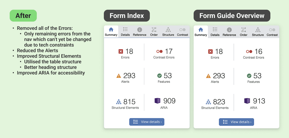
Retesting the same pages implementing the design system found major improvements in accessibility
Showcase of how the tokens can be quickly reskinned to dark mode and other brands.
My Role
Lead designer for the design system, with full ownership of the architecture and the build.
That covered creating and naming the design tokens, building tokenised components, setting up Figma styles and variables, and prototyping the interactive components. I also led adoption across a cross-functional team of 15: designers, developers, and product managers.
Problem
Ten years of debt for a product with no system, and the files showed it
There was 65 shades of grey in use across the source files alone. I'm not rounding for effect, I counted.
No consistent colour scale, no type system, no unified spacing or grid. Icon styles varied even for the same concept. Components were managed separately across four platforms, so the same button could look like four different buttons. A WAVE audit (a tool that flags accessibility problems) of the six most-visited pages found over 1,450 contrast errors, meaning text and elements too hard to read.
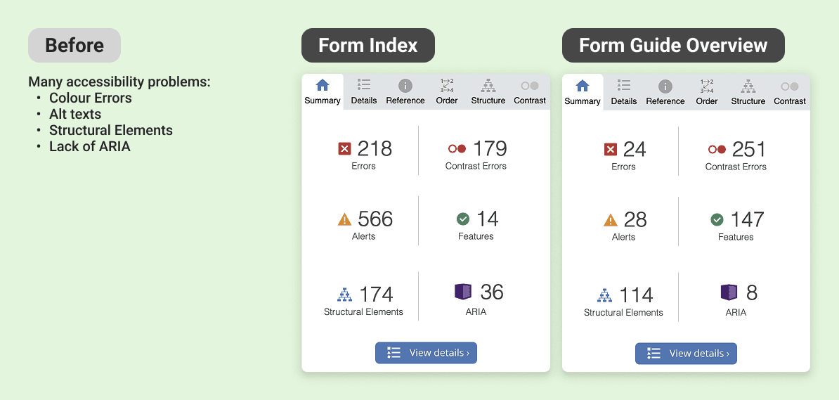
Accessibility Errors found


Goals
Produce a unified system for the whole product team
Build a fully tokenised design system in three months, ready to feed straight into the website rebuild
Clear the accessibility failures and hit WCAG AA (the standard for accessible contrast and interaction)
Create one source of truth that lines designers and developers up
Keep the existing brand feel so a loyal audience doesn't feel alienated
Future-proof it with dark mode and rebranding flexibility, including the sister site Racenet


Process
Process - Discover
I audited everything before designing anything: the Sketch files, the live site, and the CSS codebase.
I wanted the real scope, not a guess. It confirmed the picture end to end: no cohesive colour palette, no icon library, no type scale, no spacing system, no grid, and 1,450+ contrast errors across six pages. That audit became the brief. Every decision after it traced back to a specific problem I'd found.
Process - Develop
Building the Foundation
I chose the architecture for scale, not speed
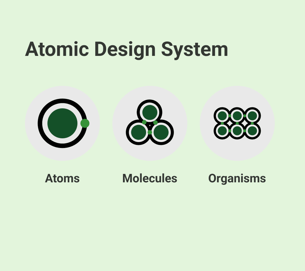
Token Studio (a Figma plugin for managing design tokens) for the token setup, and Brad Frost's Atomic Design method for structure, building from the smallest pieces up so the system stays consistent as it grows. Tokens split into global (raw values) and semantic (values with a job, like "surface" or "danger"), which is what lets a brand or theme change cascade cleanly.
I kept the brand, rebuilt the foundations
I held onto the existing Roboto typeface so the loyal audience wouldn't feel jolted, then built a proper 1.2 Minor Third type scale, sized larger on desktop than mobile, with a separate iOS token set using SF Pro so it felt native on Apple devices. I set the Material icon library as the default to kill the mismatched icon styles.
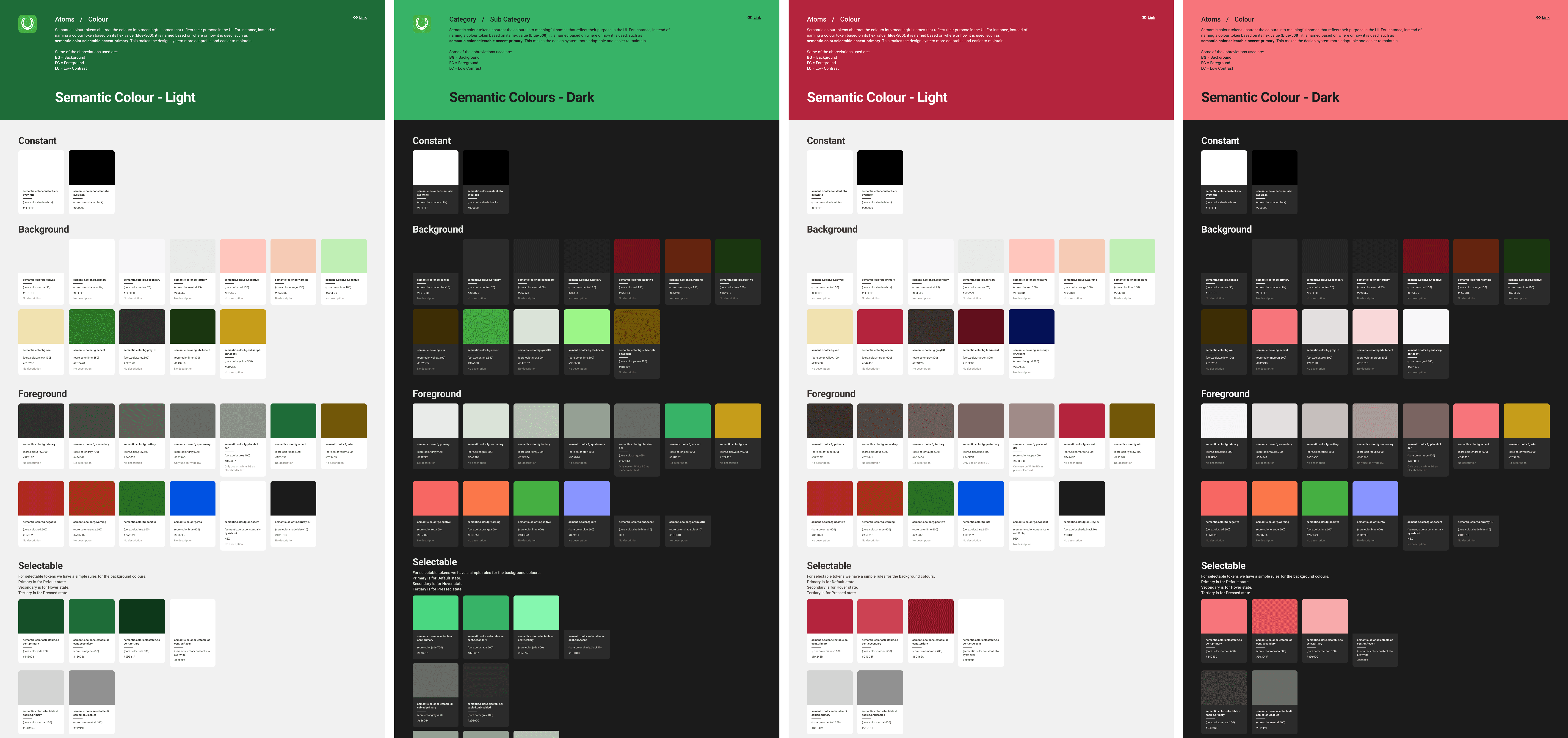
Colour was rebuilt in Leonardo Color so accessibility was structural
Leonardo generates colour scales that hold their contrast ratios, so I could bake WCAG AA into the palette itself: as a rule, a token at level 600 or above paired with 50 or below passes reliably, which gave designers a safe default instead of a contrast checker and a guess. I generated a dark mode palette alongside it, from the same token structure.
The numbered colour scales for Punters in light and dark modes
Remaining Tokens
Spacing, sizing, border radius, border widths, opacity, shadows, and blur tokens were systematically defined and integrated — straightforward to produce once the colour and type foundations were in place.
Iconography
For iconography, I adopted the Material icon library as the default set. It closely matched the existing icon style, reduced the effort of custom icon creation significantly, and still left room for bespoke icons where the brand required it.
The Material icons have a specific style that is easy to emulate to create custom icons
I built against real pages, not in a vacuum.
Buttons, inputs, checkboxes, breadcrumbs, dropdowns, and forms came first, each one tested on an actual page rather than in isolation, so it earned its place before it went in the library. I deliberately stopped at semantic tokens rather than going all the way down to component-level tokens. With three months on the clock, going deeper would have cost real time for a level of granularity the team didn't need yet. That was a scope call, and it was the right one.
Token Studio semantic tokens
Some of the selected semantic tokens used to build components
Accessibility as architecture, not afterthought
Every component was built with WCAG AA compliance as a requirement, not a review step. Accessible colour token pairings, minimum touch target sizes, keyboard focus states, screen reader labels, error messages and ARIA attributes were built into the component structure itself. Accessibility wasn't a checklist at the end, it was load-bearing.
Process - Launch & Test
A system nobody adopts is just a folder
I wrote full documentation covering colour usage, typography, component behaviour, interaction patterns, and the reasoning behind each decision, so the "why" travelled with the "what". Then I led multiple adoption sessions across the 15 people who'd be using it, walking them through the system and showing the efficiency gains early so it actually stuck rather than sitting unused.

Learnings
Constraints sharpen decisions
Stopping at semantic tokens was the right call for the timeline, not a compromise. Knowing where to stop is part of the skill.
Accessibility is a systems problem
Encoding it into the token architecture made compliance automatic, instead of a manual fix chasing 1,450+ separate errors.
Tokens need translation across platforms
Converting the tokens into Compose-compatible formats for the Android developers was more complex than I expected. A token system is only as useful as the formats each platform can actually consume, and that handoff deserved more planning than I first gave it..
Documentation is design work, not overhead
It's what makes a system transferable to people who weren't in the room when the decisions were made.
Leading without authority is a skill
I owned the system but not the team. Earning their trust, and showing the payoff early, mattered as much as the architecture itself.
Next Steps
Components will keep getting added as features are built, and the tokens will evolve with the brand. The priority now is discipline: keeping the documentation and governance up to date so the system doesn't drift back into the mess it replaced.
More works


Jul 2023 - Oct 2023
Punters Design System
Building a design system from scratch so the product team could work faster.
Design System
Tokens
Overview
Punters is a racing media platform that helps people make smarter betting decisions using stats on horse and greyhound racing. Its core audience, men aged 20 to 40, had used the site since 2014, but it had never run on a unified design system. Ten years of design debt had piled up, and the dev team's move from Nuxt 2 to Nuxt 3 opened the door to build one properly.
I built Punters' first design system from scratch in three months. It cleared 1,450+ accessibility errors, lifted designer productivity by 30%, and turned out solid enough to later rebrand an entire sister site, saving close to a month of rework down the line.
Outcomes
Resolved tech and design debt and built a system designers and developers really use.
Designer productivity up 30%. Work that took a week got done in 3 to 4 days
Contrast errors all but gone. WCAG AA across almost every component
Accessibility built in by default: touch target sizes, focus states, alt text, screen-reader support
Developers stopped hunting through design files for CSS properties
Months saved on the Racenet sister-site rebrand
Full documentation, so new people could onboard on their own
Retesting the same pages implementing the design system found major improvements in accessibility
Showcase of how the tokens can be quickly reskinned to dark mode and other brands.
My Role
Lead designer for the design system, with full ownership of the architecture and the build.
That covered creating and naming the design tokens, building tokenised components, setting up Figma styles and variables, and prototyping the interactive components. I also led adoption across a cross-functional team of 15: designers, developers, and product managers.
Problem
Ten years of debt for a product with no system, and the files showed it
There was 65 shades of grey in use across the source files alone. I'm not rounding for effect, I counted.
No consistent colour scale, no type system, no unified spacing or grid. Icon styles varied even for the same concept. Components were managed separately across four platforms, so the same button could look like four different buttons. A WAVE audit (a tool that flags accessibility problems) of the six most-visited pages found over 1,450 contrast errors, meaning text and elements too hard to read.
Accessibility Errors found
Goals
Produce a unified system for the whole product team
Build a fully tokenised design system in three months, ready to feed straight into the website rebuild
Clear the accessibility failures and hit WCAG AA (the standard for accessible contrast and interaction)
Create one source of truth that lines designers and developers up
Keep the existing brand feel so a loyal audience doesn't feel alienated
Future-proof it with dark mode and rebranding flexibility, including the sister site Racenet
Process
Process - Discover
I audited everything before designing anything: the Sketch files, the live site, and the CSS codebase.
I wanted the real scope, not a guess. It confirmed the picture end to end: no cohesive colour palette, no icon library, no type scale, no spacing system, no grid, and 1,450+ contrast errors across six pages. That audit became the brief. Every decision after it traced back to a specific problem I'd found.
Process - Develop
Building the Foundation
I chose the architecture for scale, not speed
Token Studio (a Figma plugin for managing design tokens) for the token setup, and Brad Frost's Atomic Design method for structure, building from the smallest pieces up so the system stays consistent as it grows. Tokens split into global (raw values) and semantic (values with a job, like "surface" or "danger"), which is what lets a brand or theme change cascade cleanly.
I kept the brand, rebuilt the foundations
I held onto the existing Roboto typeface so the loyal audience wouldn't feel jolted, then built a proper 1.2 Minor Third type scale, sized larger on desktop than mobile, with a separate iOS token set using SF Pro so it felt native on Apple devices. I set the Material icon library as the default to kill the mismatched icon styles.
Colour was rebuilt in Leonardo Color so accessibility was structural
Leonardo generates colour scales that hold their contrast ratios, so I could bake WCAG AA into the palette itself: as a rule, a token at level 600 or above paired with 50 or below passes reliably, which gave designers a safe default instead of a contrast checker and a guess. I generated a dark mode palette alongside it, from the same token structure.
The numbered colour scales for Punters in light and dark modes
Remaining Tokens
Spacing, sizing, border radius, border widths, opacity, shadows, and blur tokens were systematically defined and integrated — straightforward to produce once the colour and type foundations were in place.
Iconography
For iconography, I adopted the Material icon library as the default set. It closely matched the existing icon style, reduced the effort of custom icon creation significantly, and still left room for bespoke icons where the brand required it.
The Material icons have a specific style that is easy to emulate to create custom icons
I built against real pages, not in a vacuum.
Buttons, inputs, checkboxes, breadcrumbs, dropdowns, and forms came first, each one tested on an actual page rather than in isolation, so it earned its place before it went in the library. I deliberately stopped at semantic tokens rather than going all the way down to component-level tokens. With three months on the clock, going deeper would have cost real time for a level of granularity the team didn't need yet. That was a scope call, and it was the right one.
Token Studio semantic tokens
Some of the selected semantic tokens used to build components
Accessibility as architecture, not afterthought
Every component was built with WCAG AA compliance as a requirement, not a review step. Accessible colour token pairings, minimum touch target sizes, keyboard focus states, screen reader labels, error messages and ARIA attributes were built into the component structure itself. Accessibility wasn't a checklist at the end, it was load-bearing.
Process - Launch & Test
A system nobody adopts is just a folder
I wrote full documentation covering colour usage, typography, component behaviour, interaction patterns, and the reasoning behind each decision, so the "why" travelled with the "what". Then I led multiple adoption sessions across the 15 people who'd be using it, walking them through the system and showing the efficiency gains early so it actually stuck rather than sitting unused.
Learnings
Constraints sharpen decisions
Stopping at semantic tokens was the right call for the timeline, not a compromise. Knowing where to stop is part of the skill.
Accessibility is a systems problem
Encoding it into the token architecture made compliance automatic, instead of a manual fix chasing 1,450+ separate errors.
Tokens need translation across platforms
Converting the tokens into Compose-compatible formats for the Android developers was more complex than I expected. A token system is only as useful as the formats each platform can actually consume, and that handoff deserved more planning than I first gave it..
Documentation is design work, not overhead
It's what makes a system transferable to people who weren't in the room when the decisions were made.
Leading without authority is a skill
I owned the system but not the team. Earning their trust, and showing the payoff early, mattered as much as the architecture itself.
Next Steps
Components will keep getting added as features are built, and the tokens will evolve with the brand. The priority now is discipline: keeping the documentation and governance up to date so the system doesn't drift back into the mess it replaced.
More works