
Aug 2023 - Oct 2024
Form Guide Redesign
Rebuilding the data tables and tools that racing punters use to pick a runner.
Information Design
UX UI
Overview
Punters is a form guide for recreational racing punters: horses, greyhounds, harness. It isn't a bookmaker. It's there to help people make a smarter call before they bet, by turning dense racing data into something you can actually read. We'd just finished a new design system, and the form guide is the single most-visited part of the site, so it was the obvious place to start. The job: apply the design system, fix long-standing usability problems, and modernise the experience before taking it site-wide.

Outcomes
Key metrics from a year of launch:
52% reduction in bounce rate year-over-year
14% growth in engaged users year-over-year
44% increase in click-through rates across all bookmaker ad placements site-wide
79% increase in average time spent on page
3.5/5 customer satisfaction score from over 500 users surveyed one month after launch
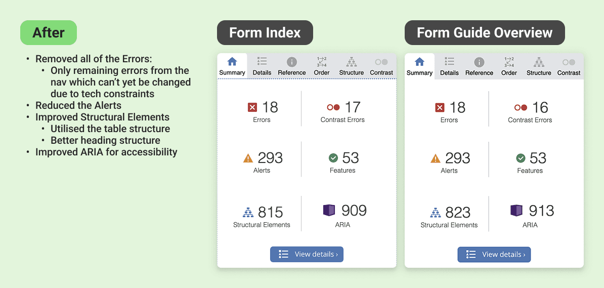
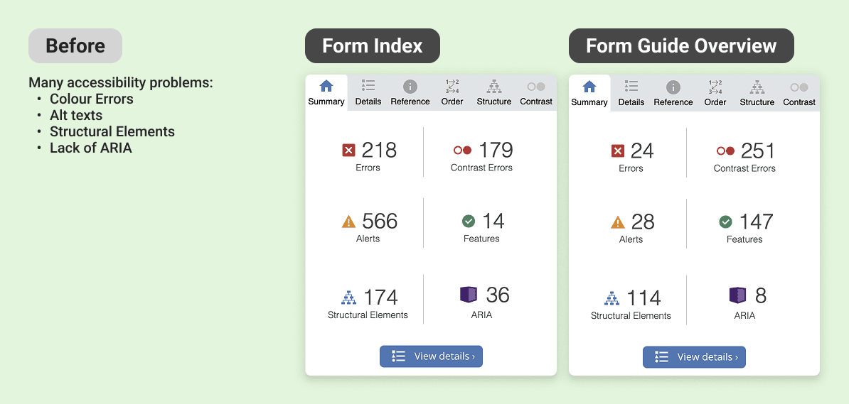
Passed WAVE accessibility checks
My Role
One of two product designers on the rebuild.
I owned the UI design. My co-designer led research and interviews; I took analysis, competitive benchmarking, design execution, and the work across teams. We sat inside a wider group: a graphic designer, web and app developers, a project manager, a business analyst, and business stakeholders.
Problem
The busiest pages on Punters were failing on accessibility, consistency, and hierarchy. That costs user trust, and it was leaving ad revenue on the table.
The site had drifted over the years. Icons, colours, and UI patterns varied page to page, so the same idea got shown different ways. For a site that sells itself as an independent, trustworthy source, that quietly chips away at confidence.
The problems went past looks. A WAVE audit (a tool that flags accessibility issues) turned up errors across colour, alt text, page structure, and missing labels. The form guide and index together pull about a third of the site's 111 million yearly views, so it mattered to get right. And the bookmaker stacker, the sold ad slots, converted badly on mobile, where most people actually were.


Goals
Better looks, better UX, a rebuilt brand, more ad sales. In practice:
Fix the hierarchy and navigation so the pages are easier to use and meet accessibility standards
Make the experience visually consistent so it reads as one product
Modernise the tools so the data is easier to understand
Lift click-throughs on the paid ad slots


Process
Process - Discover
I walked the whole site as a first-time user before touching any research
That gave me an unfiltered read on where it broke down, and it broke down fast. It wasn't beginner-friendly. Features were hard to find and harder to learn, and anyone new to racing terms got lost. The form index, the main way in to every upcoming race, was one flat list: today and the days ahead, local and international, all mixed together, no filters, no order, nothing to guide the eye.
Competitors had one thing we didn't: the fast form
I audited other platforms to see how they handled dense racing data. The standout was a quick snapshot of a runner's key stats and recent runs, so you can size up a horse without opening its full history. Most bookmakers had one. Punters didn't.
Heatmaps confirmed the hunch: nobody scrolled
People rarely went below the fold on the form index, so races weren't getting seen. The page needed a structure that pushed the right races up.
User Research & Insights
I'm not a punter, which was useful, but I couldn't design off my own assumptions
I wanted to understand how recreational punters aged 20 to 50 read their form: what sources and tools they lean on, and where we could make that easier. The team ran contextual interviews with 15 premium and lite members across desktop and mobile. Three things stood out.
People trust independent sources over bookmakers
They actively sought out non-bookmaker sites for an unbiased read. That was the opening: put race overviews, horse-by-horse comments, and expert tips straight into the form guide, and we become the trusted voice they already wanted.
Punters know their form guide layouts cold.
Years of habit anchor people to a familiar layout. Break it and you get friction, not delight. So the move wasn't to copy competitors. It was to meet people in a format they knew, then add Punters' own value on top.
Once someone picks a form resource, they rarely switch.
That makes acquisition matter, and it makes early discovery of the premium tools critical. Miss people at the start and they never come back for them.


Process - Develop
Form index: from one flat list to a page you can triage.
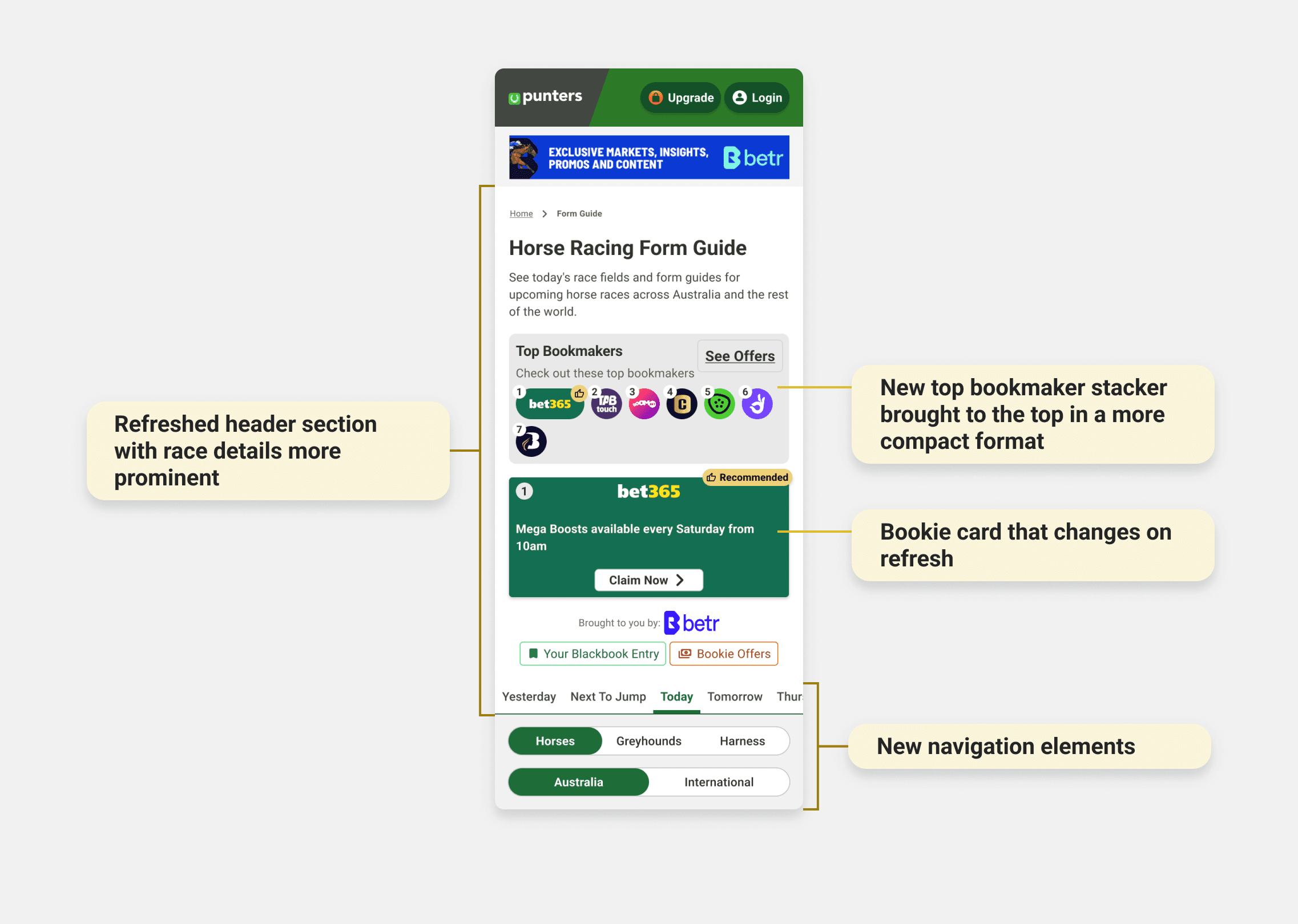
A clear header set the hierarchy from the moment you land. Tabs split the upcoming days; filters for country and racing code surfaced the races each user cared about. Race selectors carried more context inline (weather, track condition, status tags) so you could scan at a glance. A new badge system flagged black-booked horses and races with live bookie offers, so the high-value ones jumped out.
Race selectors and table were redesigned to carry more context to the race - weather, track conditions, and status tags were surfaced inline, so users could triage quickly. A refined right column reduced the original array of upcoming races down to four focused form-related actions. A new badge system on race selectors indicated horses users had black-booked, as well as races with live bookie offers, making high-value races immediately identifiable at a glance.
Bookie stacker: moved it where people actually look.
The old stacker sat under a block of SEO text on mobile, so nobody saw it. Rather than fight for a full layout change, we built a compact stacker for the top of mobile pages that fit the browsing flow instead of interrupting it. It led with a row of bookie logos, the premium slot getting more room and top billing, and one rotating card below showing a single offer at a time. Click-throughs went up 44% on desktop and mobile, and the format got rolled out across similar pages site-wide.
Form guide: the biggest overhaul
Runner info, odds, and stats were reorganised into a clear header and a restructured table, grouping related data so it's easier to compare. Blue info icons and tooltips defined unfamiliar racing terms inline, pulling out a real barrier for newer users. I added the "quick form" too, a snapshot of the positive and negative data points worth a second look. New spots for race overviews, horse-by-horse comments, and expert tips brought that trusted voice front and centre. Every tool got restyled to the design system and given an explainer modal with a tutorial video.
Lite and guest experience: sell the tool before asking for the upgrade
For people without premium, a new preview state replaced the old greyed-out tab. Icons, a short description, and a short animated clip show what the tool does, so the value is clear before anyone hits a paywall.


Process - Launch & Test
We rolled out in phases on purpose, given the traffic these pages carry
Internal testing with keen punters went smoothly. In the first week one bit of feedback kept coming up: comparing a runner's past races against its current profile was awkward when the two lived on separate tabs. The fix was simple, collapse a three-tab layout into two. After full rollout, nothing else actionable came up.

Learnings
Platform complexity is a design constraint, not an afterthought
Designing for web, mobile web, iOS, and Android at once meant learning the small but real differences between them, including legal requirements that changed the web experience in ways that mattered for UX.
Stakeholder communication is a design skill
Dev, sales, and editorial all wanted different things. Getting decisions through meant putting each one in the language that team cared about.
Data builds conviction
Heatmaps, interviews, and satisfaction scores made every decision easier to defend, and easier to improve.
Launch is the start, not the end
The post-launch tab feedback was a good reminder: no amount of internal testing matches real users at scale.
Next Steps
Keep watching engagement and satisfaction to see if the gains hold and where new friction shows up. Keep an eye on competitors for features that reset user expectations. Roll the design system out across the rest of the site, moving faster this time using what we learned here.
More works


Aug 2023 - Oct 2024
Form Guide Redesign
Rebuilding the data tables and tools that racing punters use to pick a runner.
Information Design
UX UI
Overview
Punters is a form guide for recreational racing punters: horses, greyhounds, harness. It isn't a bookmaker. It's there to help people make a smarter call before they bet, by turning dense racing data into something you can actually read. We'd just finished a new design system, and the form guide is the single most-visited part of the site, so it was the obvious place to start. The job: apply the design system, fix long-standing usability problems, and modernise the experience before taking it site-wide.
Outcomes
Key metrics from a year of launch:
52% reduction in bounce rate year-over-year
14% growth in engaged users year-over-year
44% increase in click-through rates across all bookmaker ad placements site-wide
79% increase in average time spent on page
3.5/5 customer satisfaction score from over 500 users surveyed one month after launch
Passed WAVE accessibility checks
My Role
One of two product designers on the rebuild.
I owned the UI design. My co-designer led research and interviews; I took analysis, competitive benchmarking, design execution, and the work across teams. We sat inside a wider group: a graphic designer, web and app developers, a project manager, a business analyst, and business stakeholders.
Problem
The busiest pages on Punters were failing on accessibility, consistency, and hierarchy. That costs user trust, and it was leaving ad revenue on the table.
The site had drifted over the years. Icons, colours, and UI patterns varied page to page, so the same idea got shown different ways. For a site that sells itself as an independent, trustworthy source, that quietly chips away at confidence.
The problems went past looks. A WAVE audit (a tool that flags accessibility issues) turned up errors across colour, alt text, page structure, and missing labels. The form guide and index together pull about a third of the site's 111 million yearly views, so it mattered to get right. And the bookmaker stacker, the sold ad slots, converted badly on mobile, where most people actually were.
Goals
Better looks, better UX, a rebuilt brand, more ad sales. In practice:
Fix the hierarchy and navigation so the pages are easier to use and meet accessibility standards
Make the experience visually consistent so it reads as one product
Modernise the tools so the data is easier to understand
Lift click-throughs on the paid ad slots
Process
Process - Discover
I walked the whole site as a first-time user before touching any research
That gave me an unfiltered read on where it broke down, and it broke down fast. It wasn't beginner-friendly. Features were hard to find and harder to learn, and anyone new to racing terms got lost. The form index, the main way in to every upcoming race, was one flat list: today and the days ahead, local and international, all mixed together, no filters, no order, nothing to guide the eye.
Competitors had one thing we didn't: the fast form
I audited other platforms to see how they handled dense racing data. The standout was a quick snapshot of a runner's key stats and recent runs, so you can size up a horse without opening its full history. Most bookmakers had one. Punters didn't.
Heatmaps confirmed the hunch: nobody scrolled
People rarely went below the fold on the form index, so races weren't getting seen. The page needed a structure that pushed the right races up.
User Research & Insights
I'm not a punter, which was useful, but I couldn't design off my own assumptions
I wanted to understand how recreational punters aged 20 to 50 read their form: what sources and tools they lean on, and where we could make that easier. The team ran contextual interviews with 15 premium and lite members across desktop and mobile. Three things stood out.
People trust independent sources over bookmakers
They actively sought out non-bookmaker sites for an unbiased read. That was the opening: put race overviews, horse-by-horse comments, and expert tips straight into the form guide, and we become the trusted voice they already wanted.
Punters know their form guide layouts cold.
Years of habit anchor people to a familiar layout. Break it and you get friction, not delight. So the move wasn't to copy competitors. It was to meet people in a format they knew, then add Punters' own value on top.
Once someone picks a form resource, they rarely switch.
That makes acquisition matter, and it makes early discovery of the premium tools critical. Miss people at the start and they never come back for them.
Process - Develop
Form index: from one flat list to a page you can triage.
A clear header set the hierarchy from the moment you land. Tabs split the upcoming days; filters for country and racing code surfaced the races each user cared about. Race selectors carried more context inline (weather, track condition, status tags) so you could scan at a glance. A new badge system flagged black-booked horses and races with live bookie offers, so the high-value ones jumped out.
Race selectors and table were redesigned to carry more context to the race - weather, track conditions, and status tags were surfaced inline, so users could triage quickly. A refined right column reduced the original array of upcoming races down to four focused form-related actions. A new badge system on race selectors indicated horses users had black-booked, as well as races with live bookie offers, making high-value races immediately identifiable at a glance.
Bookie stacker: moved it where people actually look.
The old stacker sat under a block of SEO text on mobile, so nobody saw it. Rather than fight for a full layout change, we built a compact stacker for the top of mobile pages that fit the browsing flow instead of interrupting it. It led with a row of bookie logos, the premium slot getting more room and top billing, and one rotating card below showing a single offer at a time. Click-throughs went up 44% on desktop and mobile, and the format got rolled out across similar pages site-wide.
Form guide: the biggest overhaul
Runner info, odds, and stats were reorganised into a clear header and a restructured table, grouping related data so it's easier to compare. Blue info icons and tooltips defined unfamiliar racing terms inline, pulling out a real barrier for newer users. I added the "quick form" too, a snapshot of the positive and negative data points worth a second look. New spots for race overviews, horse-by-horse comments, and expert tips brought that trusted voice front and centre. Every tool got restyled to the design system and given an explainer modal with a tutorial video.
Lite and guest experience: sell the tool before asking for the upgrade
For people without premium, a new preview state replaced the old greyed-out tab. Icons, a short description, and a short animated clip show what the tool does, so the value is clear before anyone hits a paywall.
Process - Launch & Test
We rolled out in phases on purpose, given the traffic these pages carry
Internal testing with keen punters went smoothly. In the first week one bit of feedback kept coming up: comparing a runner's past races against its current profile was awkward when the two lived on separate tabs. The fix was simple, collapse a three-tab layout into two. After full rollout, nothing else actionable came up.
Learnings
Platform complexity is a design constraint, not an afterthought
Designing for web, mobile web, iOS, and Android at once meant learning the small but real differences between them, including legal requirements that changed the web experience in ways that mattered for UX.
Stakeholder communication is a design skill
Dev, sales, and editorial all wanted different things. Getting decisions through meant putting each one in the language that team cared about.
Data builds conviction
Heatmaps, interviews, and satisfaction scores made every decision easier to defend, and easier to improve.
Launch is the start, not the end
The post-launch tab feedback was a good reminder: no amount of internal testing matches real users at scale.
Next Steps
Keep watching engagement and satisfaction to see if the gains hold and where new friction shows up. Keep an eye on competitors for features that reset user expectations. Roll the design system out across the rest of the site, moving faster this time using what we learned here.
More works