
Jul 2022 - Jan 2023
Pay By Account
Mastercard's new payment method that lets customers pay straight from their bank account at checkout.
Fintech
UX UI
Overview
I designed the reseller and merchant portals for a new Mastercard payment product, end to end, from research through to signed-off, production-ready prototypes. Every design deadline was met and stakeholder testing passed cleanly. The product was later scoped down on the client side, for reasons outside the design team.
Mastercard was launching Pay by Account, a way to pay directly from your bank account at checkout. To support it they needed three portals: one for resellers (the banks), one for merchants, and one for customers, running the operational side of the product: transaction overviews, dispute management, merchant onboarding and offboarding, and financial reporting.

Outcomes
Clear, production-ready designs for merchants to manage transactions
The high-fidelity Figma prototypes went down well with the Mastercard client team. Stakeholder testing showed users could move through the portals and finish key tasks without friction: reviewing merchant accounts, onboarding and offboarding, dispute management, and API key generation. The experience across all three portals was consistent unifying the brand identity.
The project was later scoped down on the client side, for reasons outside the design team's remit. The design work itself was signed off and production-ready.
My Role
One of two UX/UI designers, responsible for the reseller and merchant portals end to end.
Working alongside a design lead, I turned each user type's distinct needs into flows, wireframes, and high-fidelity prototypes. I worked inside a team of 10 and managed stakeholder input at every stage, from discovery through to prototype sign-off.
Problem
One system had to serve three very different users, on a fixed timeline, to MVP scope.
Pay by Account was a new product going into a competitive market, and launching without a purpose-built admin portal wasn't an option.
Customers needed to review transactions and raise disputes.
Merchants needed financial summaries to steer business decisions.
Resellers (the banks distributing the product) had the most complex job: overseeing merchant accounts, onboarding and offboarding, managing contacts, and reviewing financial performance across their whole portfolio.
Building for all three at once meant getting sharp about priorities from the start.
Goals
Create an experience users understand and adopt quickly
Ship an MVP fast enough to stay competitive - include only what was essential for launch, defer everything else
Design clear, trustworthy navigation across all three portals - critical for a financial product where user confidence is non-negotiable
Enable resellers to carry out their full operational responsibilities: merchant onboarding, offboarding, profile management, and financial oversight
Give merchants actionable financial summaries to support day-to-day business decisions
Maintain a consistent experience across all three portals through a shared design system and interaction patterns


Process
Process - Discover
I started with interviews because the reseller workflows were new territory for us.
I spoke to internal and client-side stakeholders to get a clear picture of reseller needs, pain points, and responsibilities. That mattered most for the merchant portal, where the workflows were complex. The interviews grounded every later decision in real operational context instead of assumption.
Structure before screens
After a workshop to align on MVP scope, I mapped the user flows and information architecture for both portals. Getting that right before touching a single screen made the wireframing quick and purposeful, because each page's job was already clear.
Process - Develop
Stakeholder input reshaped the structure, and that's the point of showing it early
After I presented the initial architecture and screens, two things changed. Settlements (meant to help resellers track earnings per merchant) got pushed to a later phase; it was still half-formed, and forcing it into the MVP would have added complexity without reliable value. And in testing, stakeholders didn't expect API key generation to sit apart from the merchant profile, so we moved that action into the individual merchant pages, where people were already working.
Cutting the onboarding flow from three approvals to one
The original onboarding and offboarding flows needed sign-off from three separate admins. Thorough, but too complex to build in the time we had. Working closely with the backend developers, we cut the verification to a single confirmation email: faster to build, easier for resellers to action, and no less secure for MVP.
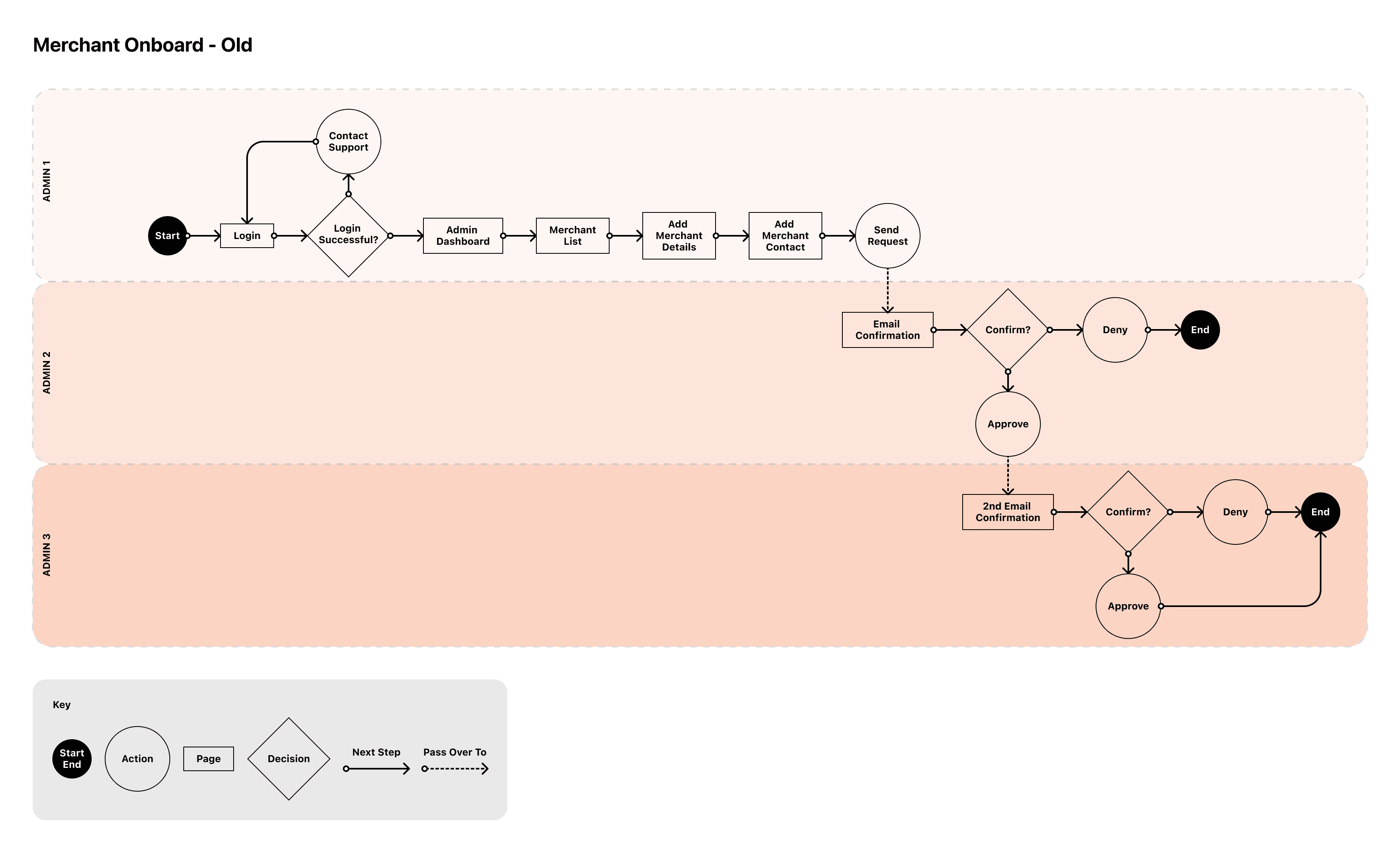
Figure 1. Original onboarding flow that involved 3 admins to fully onboard a new merchant.
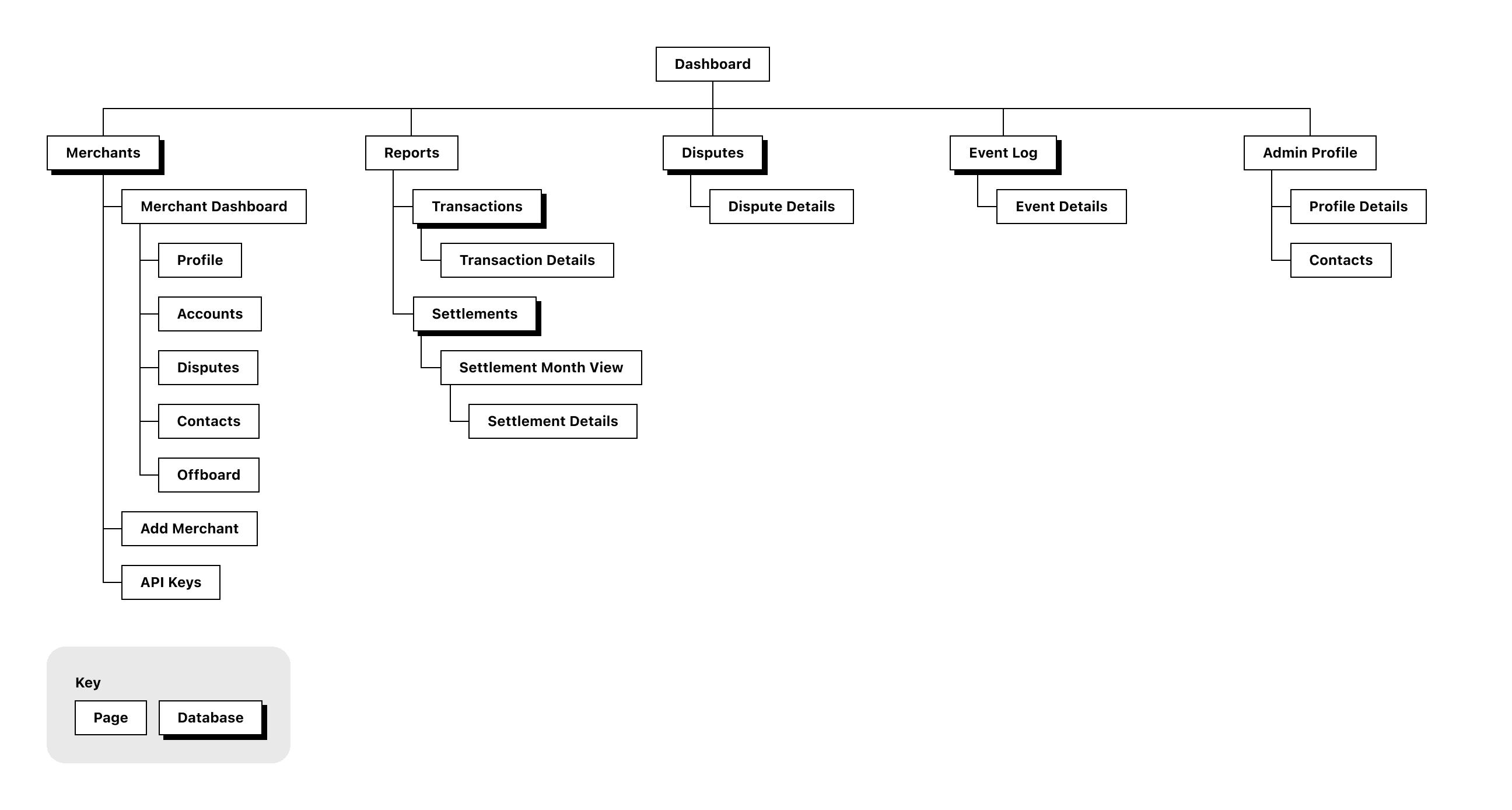
Figure 2. Original information architecture
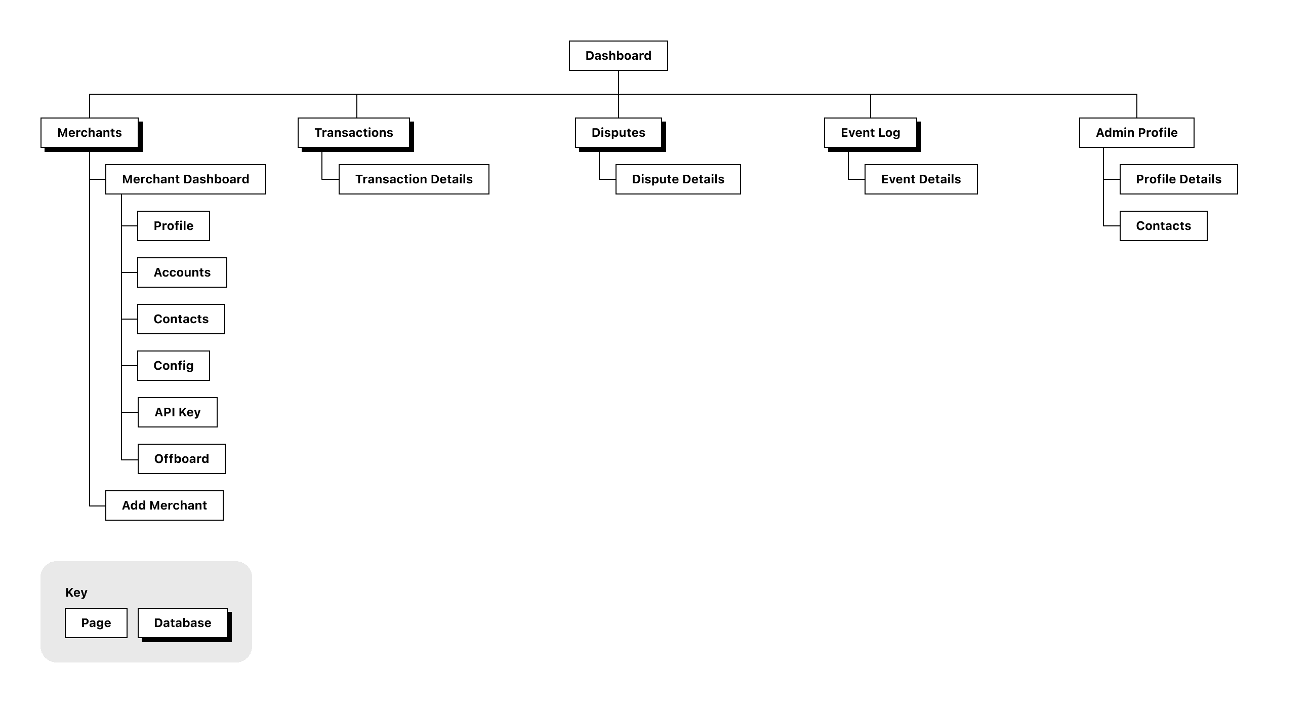
Figure 3. The revised information architecture
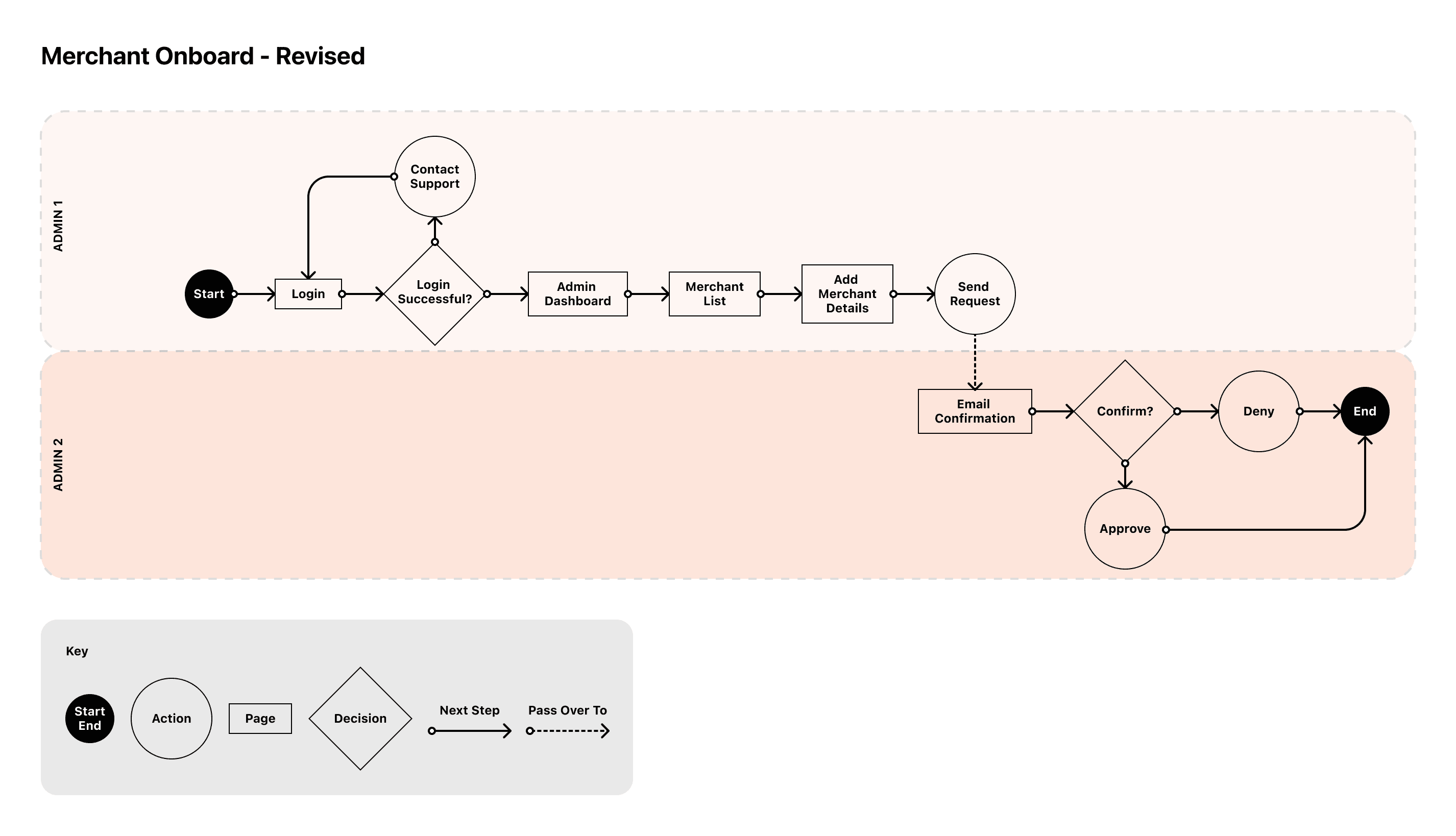
Figure 4. The revised merchant onboard flow
The scope calls paid off at testing
Prototype testing with stakeholders confirmed the core flows, merchant review, onboarding, offboarding, and API key generation, had no major structural issues. That was largely because the earlier decisions about what to defer had already headed off most of the navigation and discoverability problems before anyone hit them.
Learnings
Financial products demand structural clarity above all else
When users are managing disputes or onboarding merchants, unclear navigation isn't a small UX issue, it's a trust issue. Getting the information architecture right early was the single most important investment on this project.
MVP discipline is a design skill
Every feature decision had knock-on effects for the build. Learning to argue for deferral, as with Settlements, rather than trying to design everything at once, was a big part of shipping something coherent and on time.
Backend constraints are design constraints
Pulling developers into flow reviews early, instead of handing over finished designs for sign-off, saved a lot of rework.
Stakeholder testing surfaces IA problems that wireframe reviews don't
The API key placement only showed up once real users were navigating with a task in mind.
Next Steps
The foundation is in place. Future phases should prioritise building out Settlements for resellers, richer dispute tracking with full stage history and audit logs, and more granular analytics for merchants. That moves the portal from an operational tool to a real business intelligence resource.
More works


Jul 2022 - Jan 2023
Pay By Account
Mastercard's new payment method that lets customers pay straight from their bank account at checkout.
Fintech
UX UI
Overview
I designed the reseller and merchant portals for a new Mastercard payment product, end to end, from research through to signed-off, production-ready prototypes. Every design deadline was met and stakeholder testing passed cleanly. The product was later scoped down on the client side, for reasons outside the design team.
Mastercard was launching Pay by Account, a way to pay directly from your bank account at checkout. To support it they needed three portals: one for resellers (the banks), one for merchants, and one for customers, running the operational side of the product: transaction overviews, dispute management, merchant onboarding and offboarding, and financial reporting.
Outcomes
Clear, production-ready designs for merchants to manage transactions
The high-fidelity Figma prototypes went down well with the Mastercard client team. Stakeholder testing showed users could move through the portals and finish key tasks without friction: reviewing merchant accounts, onboarding and offboarding, dispute management, and API key generation. The experience across all three portals was consistent unifying the brand identity.
The project was later scoped down on the client side, for reasons outside the design team's remit. The design work itself was signed off and production-ready.
My Role
One of two UX/UI designers, responsible for the reseller and merchant portals end to end.
Working alongside a design lead, I turned each user type's distinct needs into flows, wireframes, and high-fidelity prototypes. I worked inside a team of 10 and managed stakeholder input at every stage, from discovery through to prototype sign-off.
Problem
One system had to serve three very different users, on a fixed timeline, to MVP scope.
Pay by Account was a new product going into a competitive market, and launching without a purpose-built admin portal wasn't an option.
Customers needed to review transactions and raise disputes.
Merchants needed financial summaries to steer business decisions.
Resellers (the banks distributing the product) had the most complex job: overseeing merchant accounts, onboarding and offboarding, managing contacts, and reviewing financial performance across their whole portfolio.
Building for all three at once meant getting sharp about priorities from the start.
Goals
Create an experience users understand and adopt quickly
Ship an MVP fast enough to stay competitive - include only what was essential for launch, defer everything else
Design clear, trustworthy navigation across all three portals - critical for a financial product where user confidence is non-negotiable
Enable resellers to carry out their full operational responsibilities: merchant onboarding, offboarding, profile management, and financial oversight
Give merchants actionable financial summaries to support day-to-day business decisions
Maintain a consistent experience across all three portals through a shared design system and interaction patterns
Process
Process - Discover
I started with interviews because the reseller workflows were new territory for us.
I spoke to internal and client-side stakeholders to get a clear picture of reseller needs, pain points, and responsibilities. That mattered most for the merchant portal, where the workflows were complex. The interviews grounded every later decision in real operational context instead of assumption.
Structure before screens
After a workshop to align on MVP scope, I mapped the user flows and information architecture for both portals. Getting that right before touching a single screen made the wireframing quick and purposeful, because each page's job was already clear.
Process - Develop
Stakeholder input reshaped the structure, and that's the point of showing it early
After I presented the initial architecture and screens, two things changed. Settlements (meant to help resellers track earnings per merchant) got pushed to a later phase; it was still half-formed, and forcing it into the MVP would have added complexity without reliable value. And in testing, stakeholders didn't expect API key generation to sit apart from the merchant profile, so we moved that action into the individual merchant pages, where people were already working.
Cutting the onboarding flow from three approvals to one
The original onboarding and offboarding flows needed sign-off from three separate admins. Thorough, but too complex to build in the time we had. Working closely with the backend developers, we cut the verification to a single confirmation email: faster to build, easier for resellers to action, and no less secure for MVP.
Figure 1. Original onboarding flow that involved 3 admins to fully onboard a new merchant.
Figure 2. Original information architecture
Figure 3. The revised information architecture
Figure 4. The revised merchant onboard flow
The scope calls paid off at testing
Prototype testing with stakeholders confirmed the core flows, merchant review, onboarding, offboarding, and API key generation, had no major structural issues. That was largely because the earlier decisions about what to defer had already headed off most of the navigation and discoverability problems before anyone hit them.
Learnings
Financial products demand structural clarity above all else
When users are managing disputes or onboarding merchants, unclear navigation isn't a small UX issue, it's a trust issue. Getting the information architecture right early was the single most important investment on this project.
MVP discipline is a design skill
Every feature decision had knock-on effects for the build. Learning to argue for deferral, as with Settlements, rather than trying to design everything at once, was a big part of shipping something coherent and on time.
Backend constraints are design constraints
Pulling developers into flow reviews early, instead of handing over finished designs for sign-off, saved a lot of rework.
Stakeholder testing surfaces IA problems that wireframe reviews don't
The API key placement only showed up once real users were navigating with a task in mind.
Next Steps
The foundation is in place. Future phases should prioritise building out Settlements for resellers, richer dispute tracking with full stage history and audit logs, and more granular analytics for merchants. That moves the portal from an operational tool to a real business intelligence resource.
More works